Link - Rethinking therapy for teens
Links’ mission is to end the youth mental health crisis by preventing 1% of hospitalizations. They plan to achieve this by creating a new platform with younger, more relatable mentors who offer flexible coaching to teenagers.
Redesign of the homepage

When I began collaborating with Link, their initial designs were not user-friendly. One of my first actions was conducting an audit to understand the company's goals. Following this, I prioritized redesigning the homepage features to better reflect those objectives.
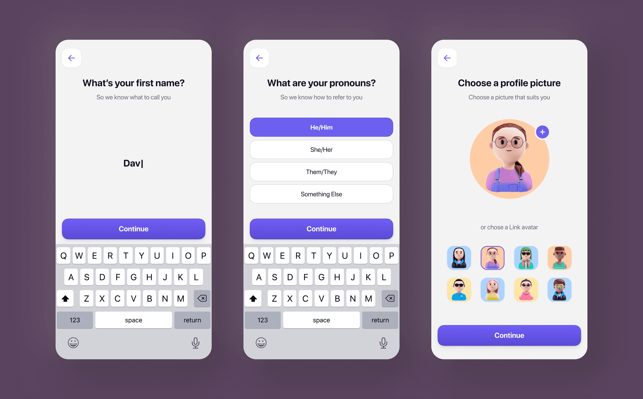
Streamlined onboarding and privacy-focused avatars

Our onboarding is streamlined, using only a phone number for login to avoid reliance on Gmail or Apple IDs. For privacy, teens can select from preset avatars instead of uploading personal photos.
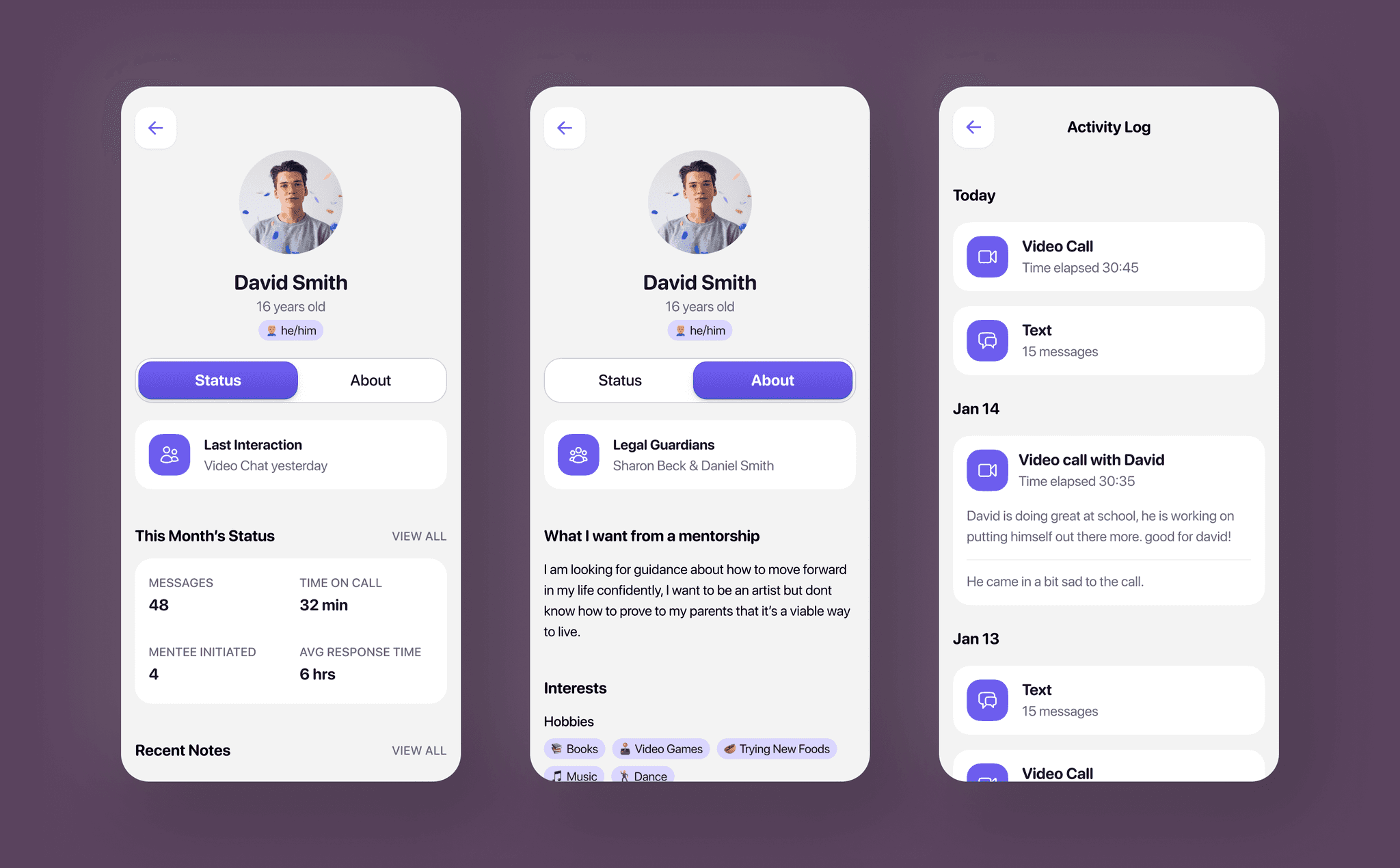
Mentee profiles: centralizing key info and interaction insights

To support mentors with multiple mentees, I designed mentee profiles to consolidate critical information in one place, including interests, legal guardians, activity logs, personal notes, and key interaction analytics.
Inbox-inspired homepage: Streamlining mentor-mentee communication

I modeled the mentor homepage on an inbox layout to facilitate seamless communication between mentors and mentees, incorporating event rows for task and special event tracking related to their mentees.
Seamless scheduling: video check-ins

We developed a scheduling system for mentors to arrange video call check-ins with their mentees, using familiar iOS design patterns for ease of use. A reminder toast appears at the bottom of the chat 24 hours before a call, keeping it front and center for both parties.
Pre-call previews: helping mentees prepare for meetings

Before mentees joined calls we wanted to make sure that they were comfortable and ready, we would provide a preview in a sheet so they could see themselves and make sure they were situated before meeting withe thier mentor
Mentor taking notes

To help mentors manage multiple mentees, we equipped them with tools to monitor progress. Our notes feature automatically gathers insights from video calls and chats, enabling mentors to write and revisit notes later.
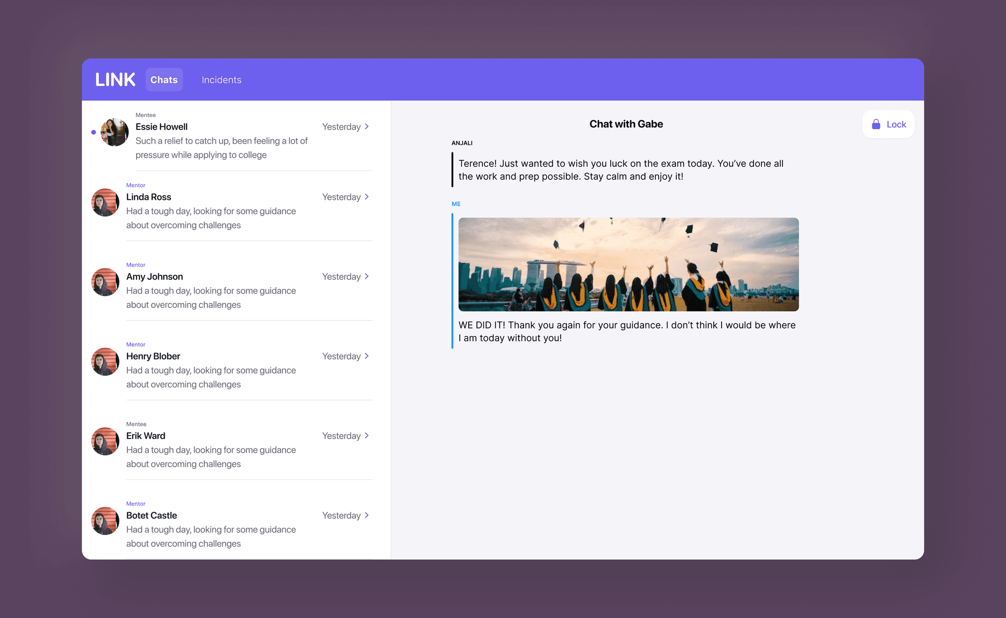
Admin dashboard: chat management for Team Link

We developed an admin dashboard enabling Link Team members to lock, unlock, or intervene in chats as needed. Despite being one of the few desktop views for Link, its integration was streamlined thanks to a robust design system.
Feature carousel: building trust with parents and teens

Our feature carousel, designed for both parents and teens, aimed to highlight our company's philosophy to build trust and support for our mission from both groups.